CASE
Landing Page for Monodukuri.com
OVERVIEW
- TIMELINE1.10.2024
- DURATION OF THE PROJECT2 Weeks
- CLIENTMonodukuri.com
- RESPONSIBILITIESConcept & art direction, High-impact photography selection, industrial color palette design, Mobile-first responsive layout, Front-end coding & optimization
-
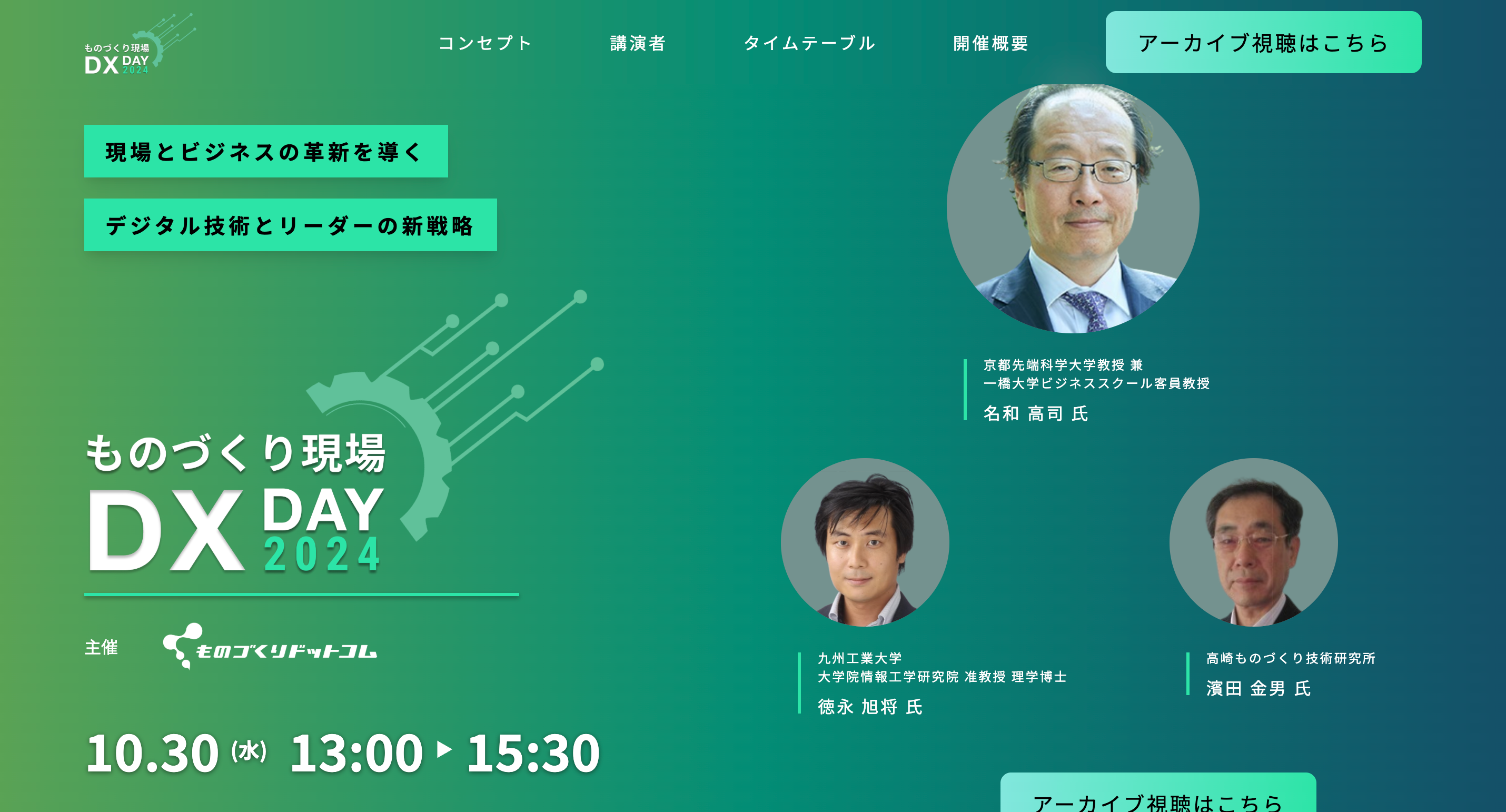
Created a raw, immersive event landing page celebrating authentic craftsmanship. Used dramatic close-up photography of tools, sparks, materials, and artisans in action. Built with an industrial palette (deep grays, rust orange, metallic silver, warm earth tones) for factory authenticity, high contrast, and full mobile responsiveness.
Use case section
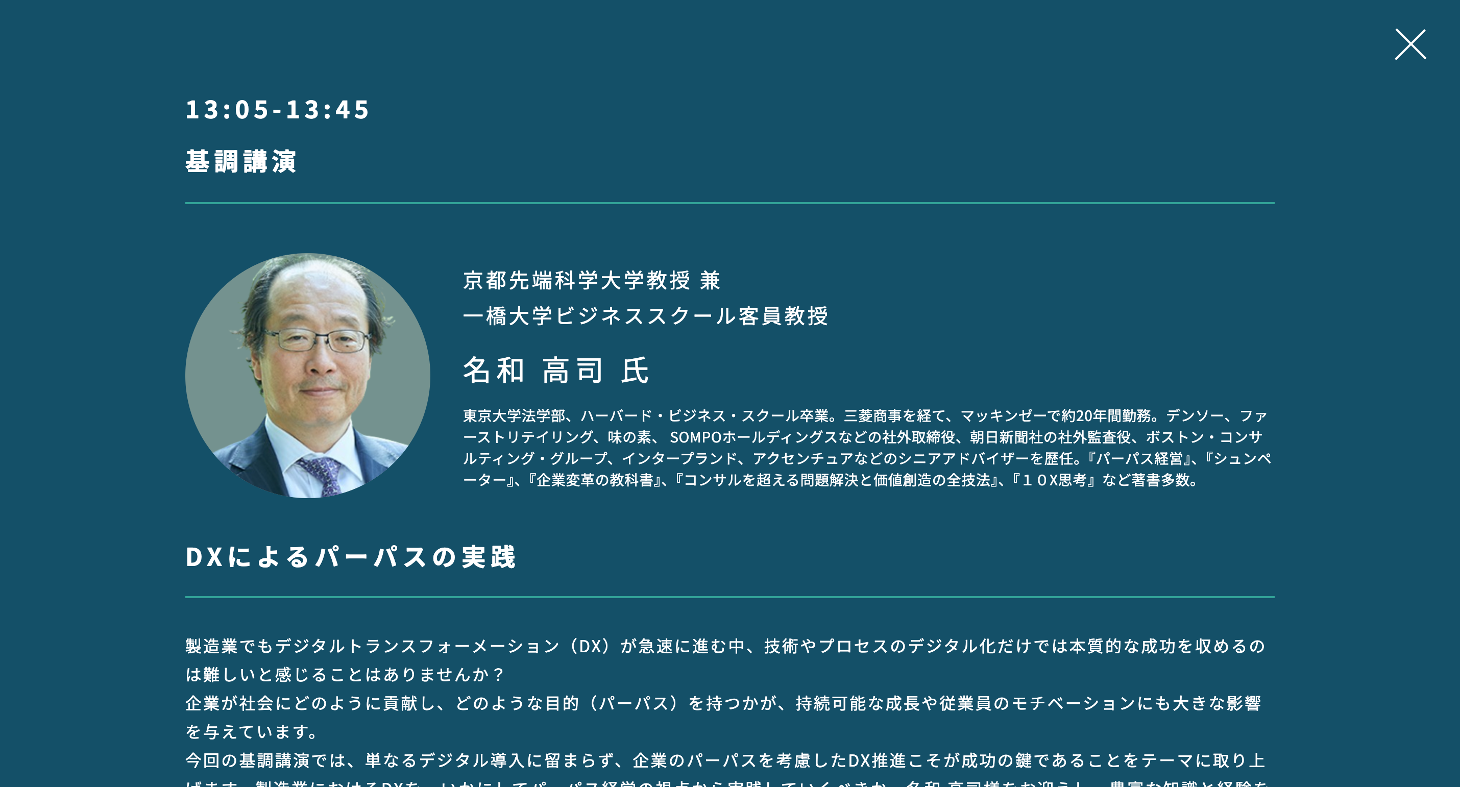
Designed and developed a dedicated event landing page emphasizing the authentic essence of craftsmanship and hands-on manufacturing. Incorporated high-impact photography—such as close-ups of tools in action, raw materials being shaped, workshop environments with sparks or textures, and skilled artisans at work—to visually immerse visitors in the “maker” world, evoking tactile quality and dedication to process. Selected an industrial color palette of deep grays, rust oranges, metallic silvers, and warm earth tones to mirror factory authenticity while ensuring high contrast for readability and mobile responsiveness.
Use case section
Use case section
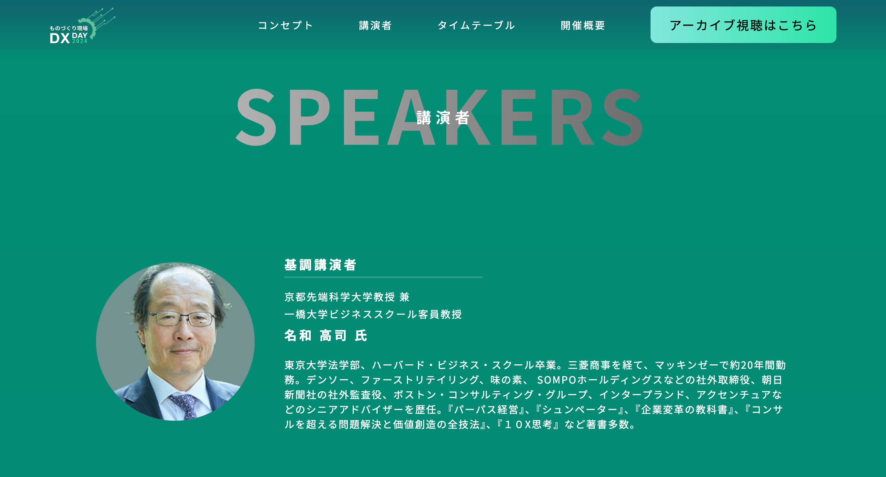
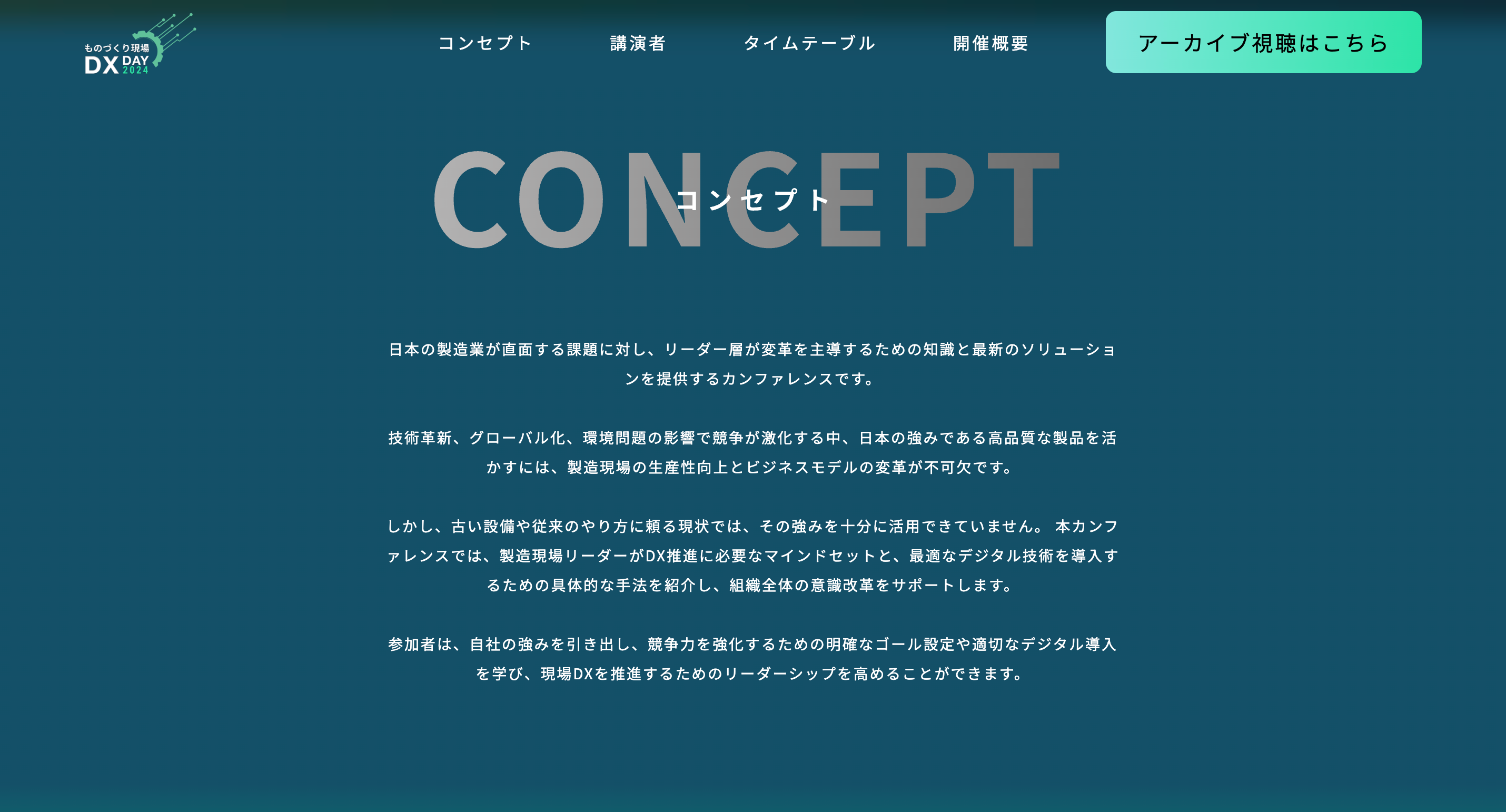
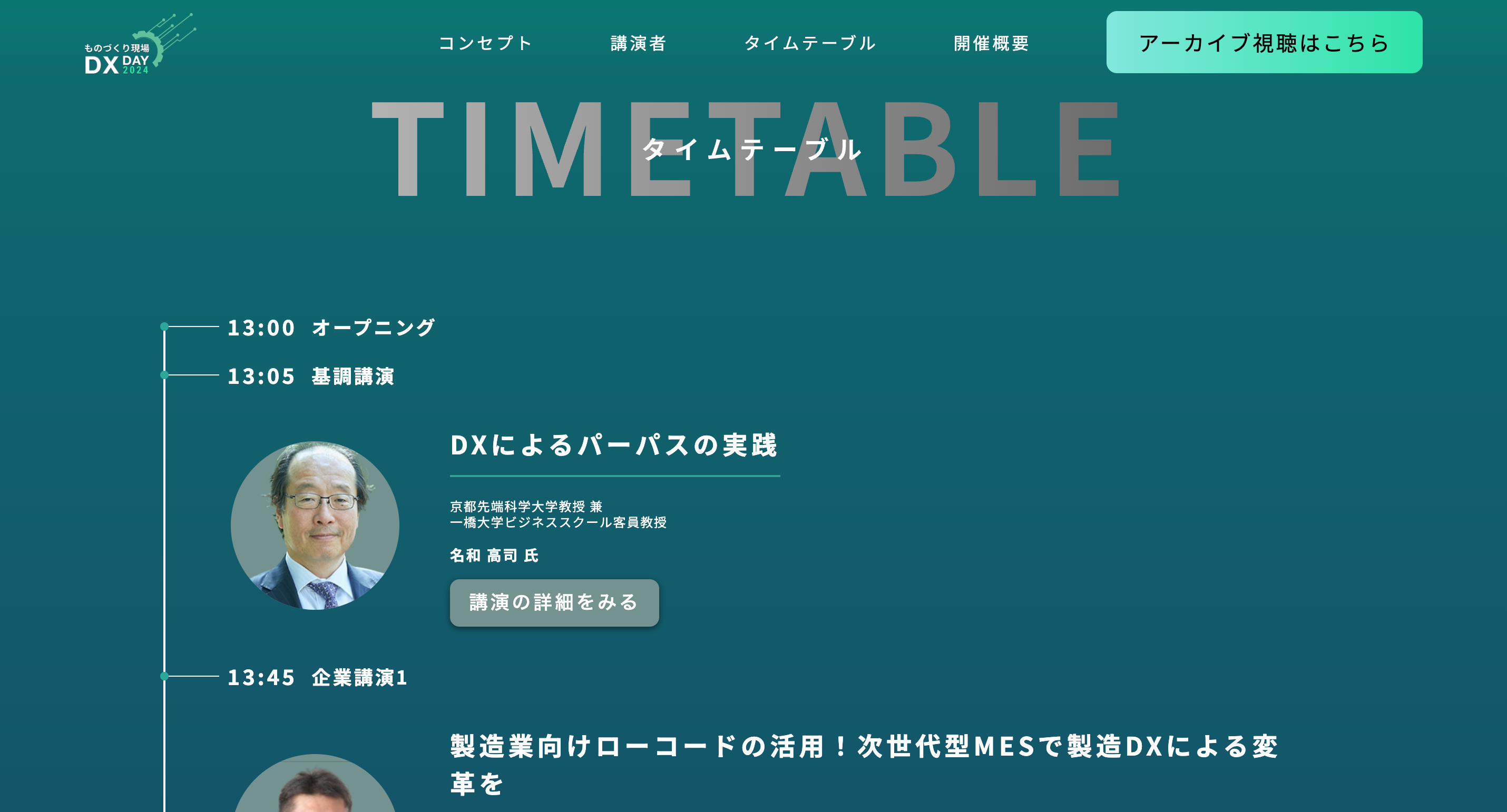
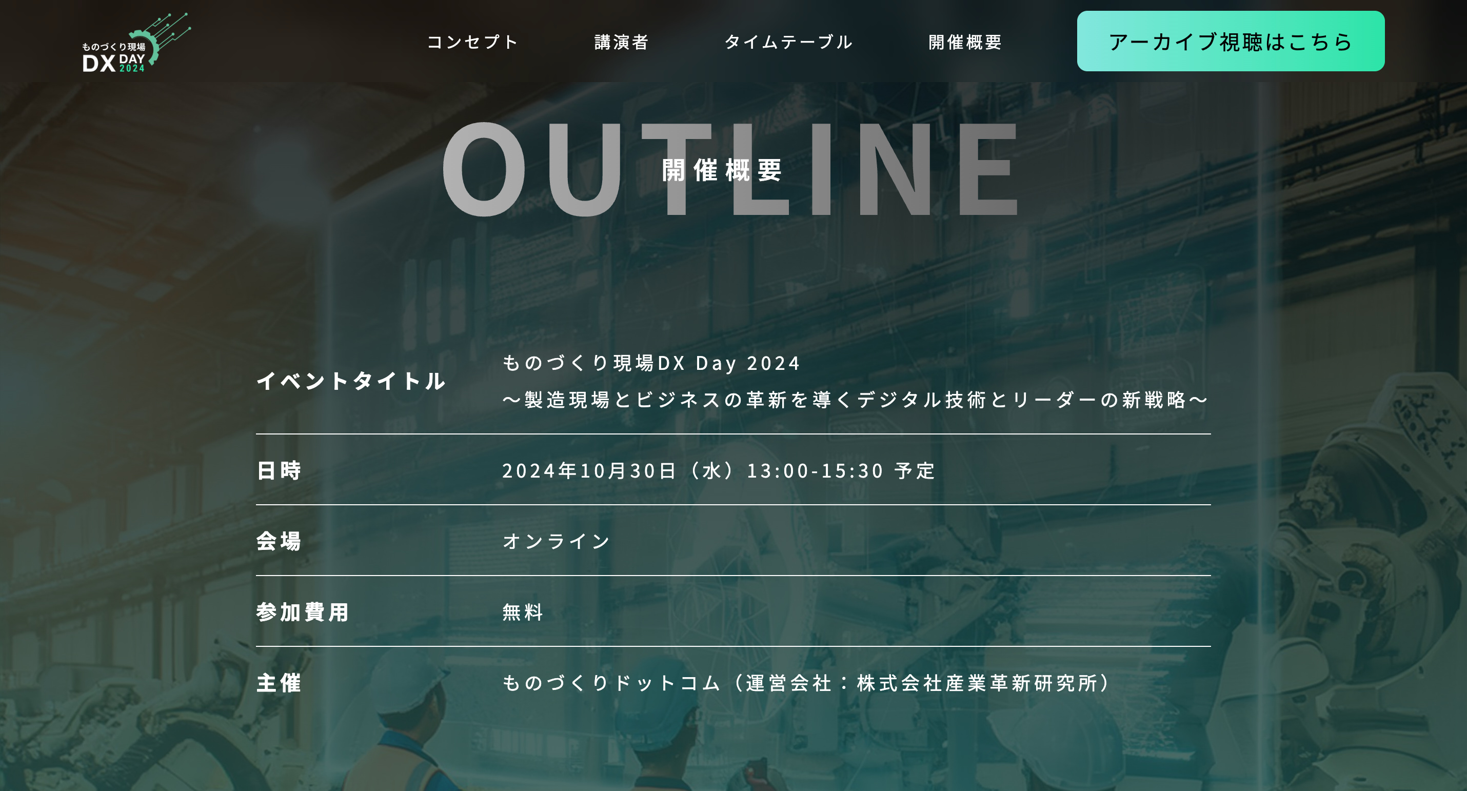
Structured the page with a long-form scroll that builds narrative flow: a bold hero section with countdown timer and key visuals for immediate engagement, followed by sections on event agenda, speaker spotlights with process-oriented bios, testimonials from past makers, and frictionless CTAs for registration or tickets. This design prioritizes user journey tailored to makers—highlighting practical value like networking, skill-sharing, and inspiration—driving conversions through emotional connection and clear value propositions
Use case section
Use case section