CASE
Landing Page for Robot Payment
OVERVIEW
- TIMELINE1.06.2025
- DURATION OF THE PROJECT2 Weeks
- CLIENTRobot Payment
- RESPONSIBILITIESFull strategy & positioning, Information architecture & UX flow, Tone-of-voice creation, Complete copywriting, Visual direction & moodboard, Conversion-focused layout design
-
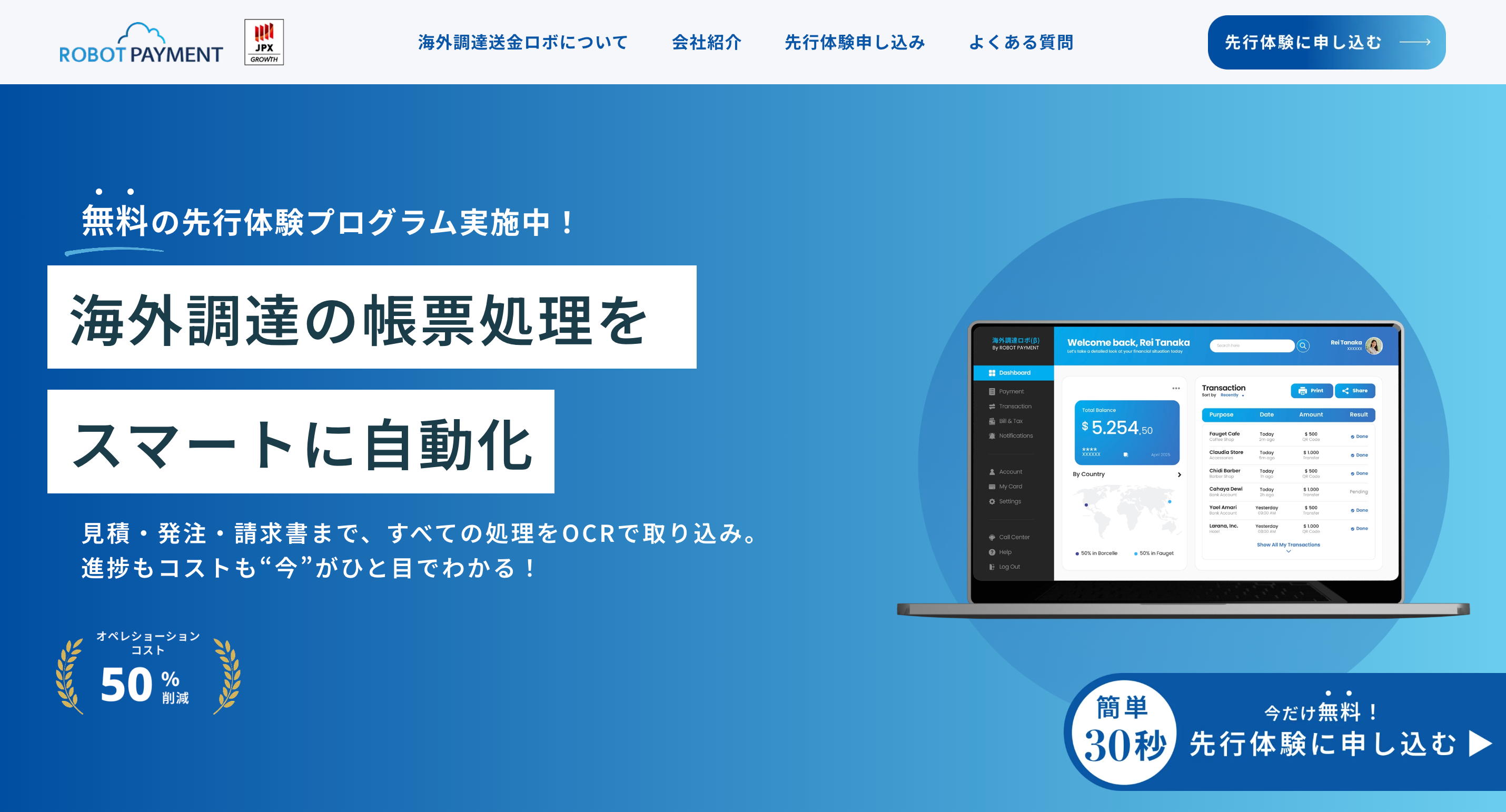
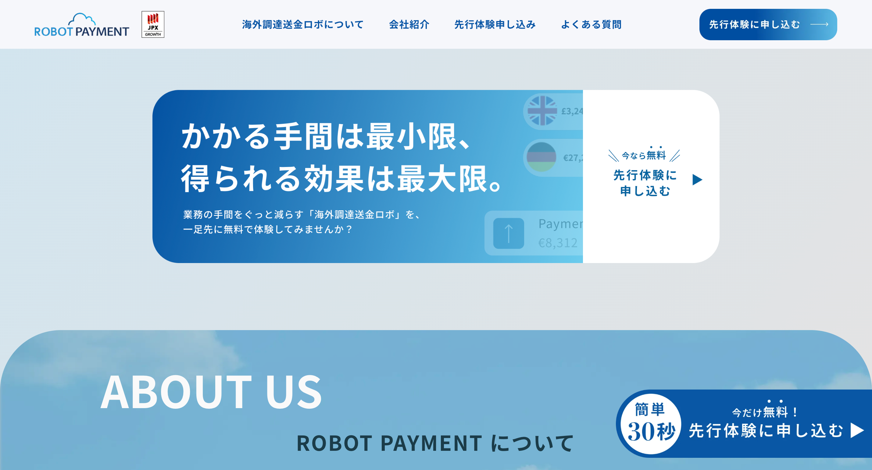
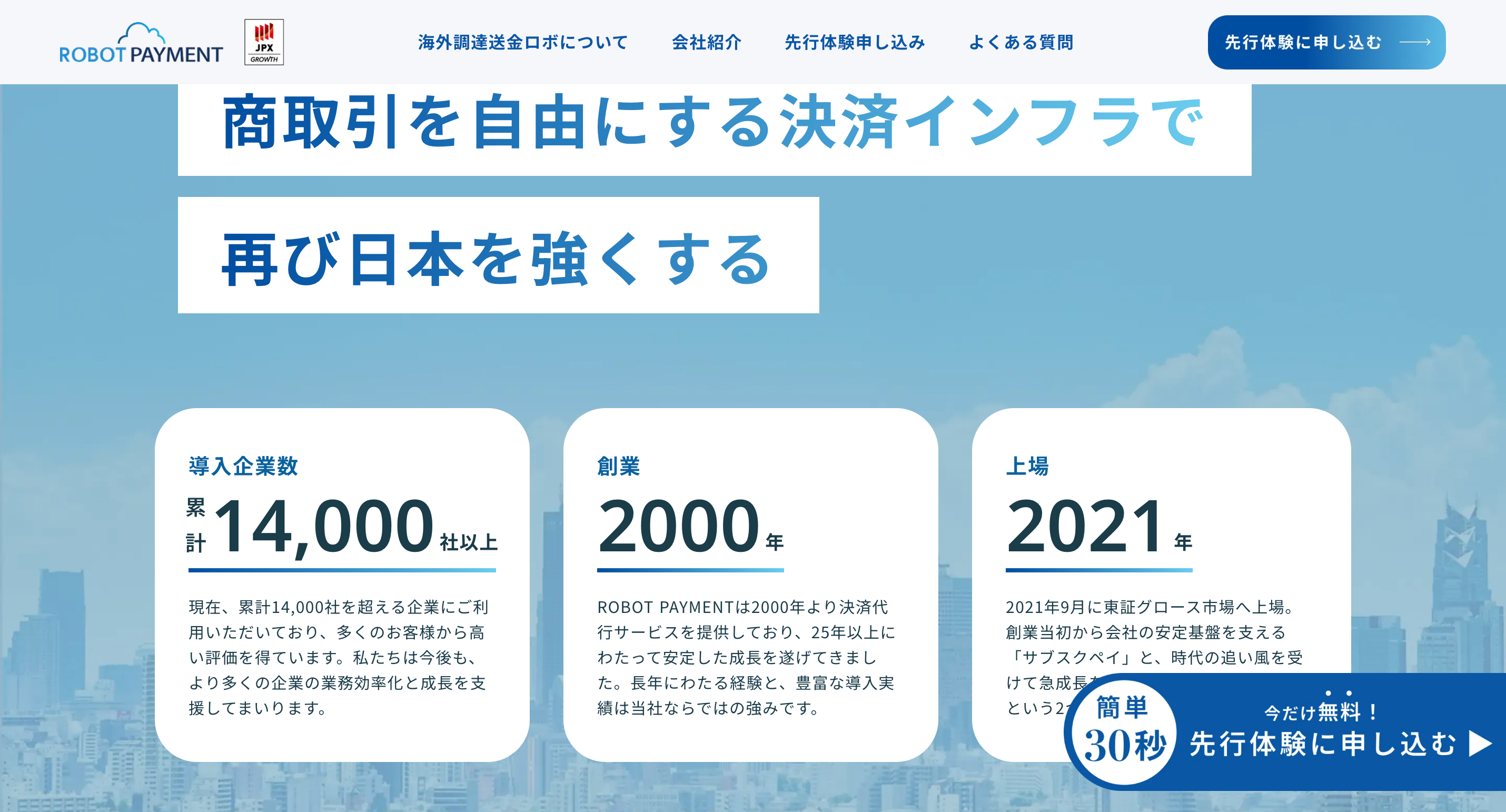
I single-handedly planned, wrote, and delivered a high-converting landing page for a fintech startup specializing in ultra-low-cost international remittances and overseas procurement payments. The client wanted to stand out in a market dominated by stiff, bank-like branding — so we built something completely different: warm, human, bold, and instantly trustworthy.
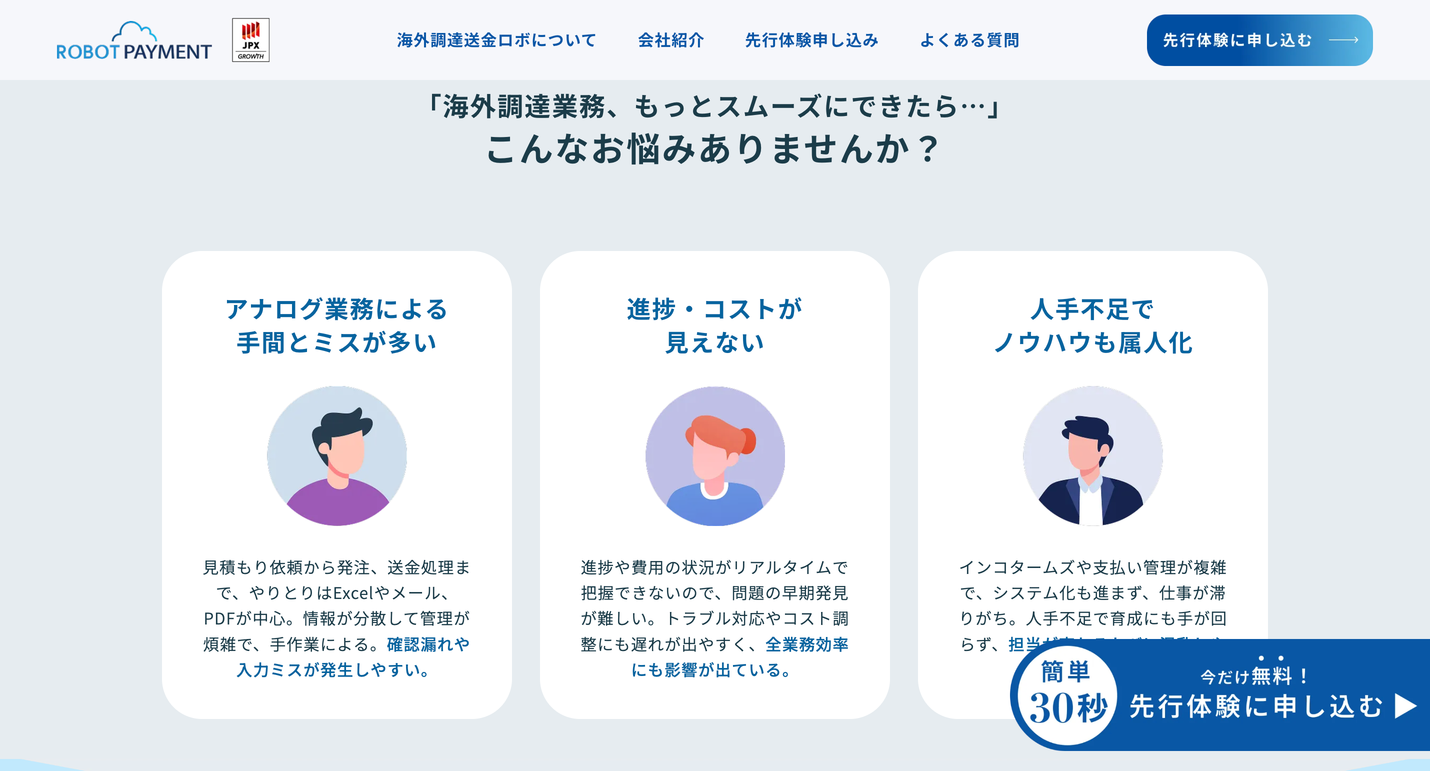
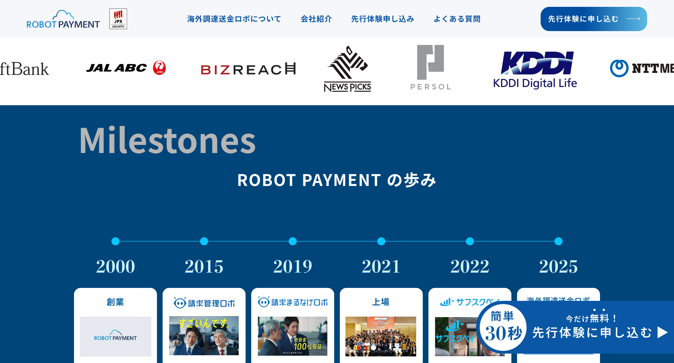
Use case section
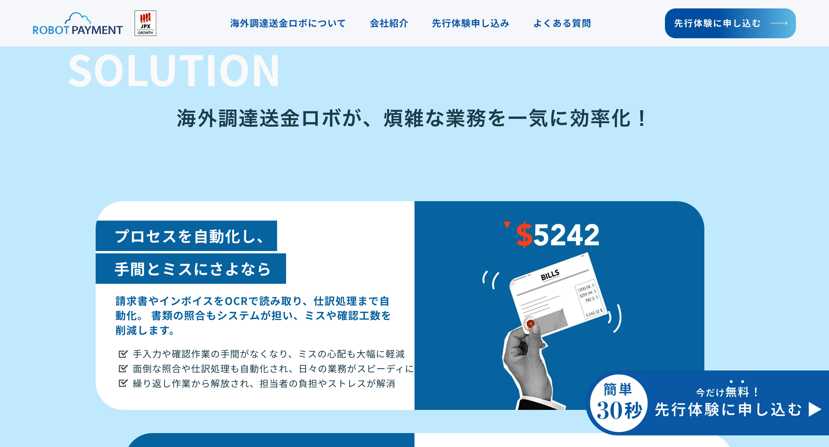
Process section
The Challenge Traditional financial service websites feel cold and corporate. Users were hesitant to trust yet another “cheaper-than-banks” promise. The client needed a page that:
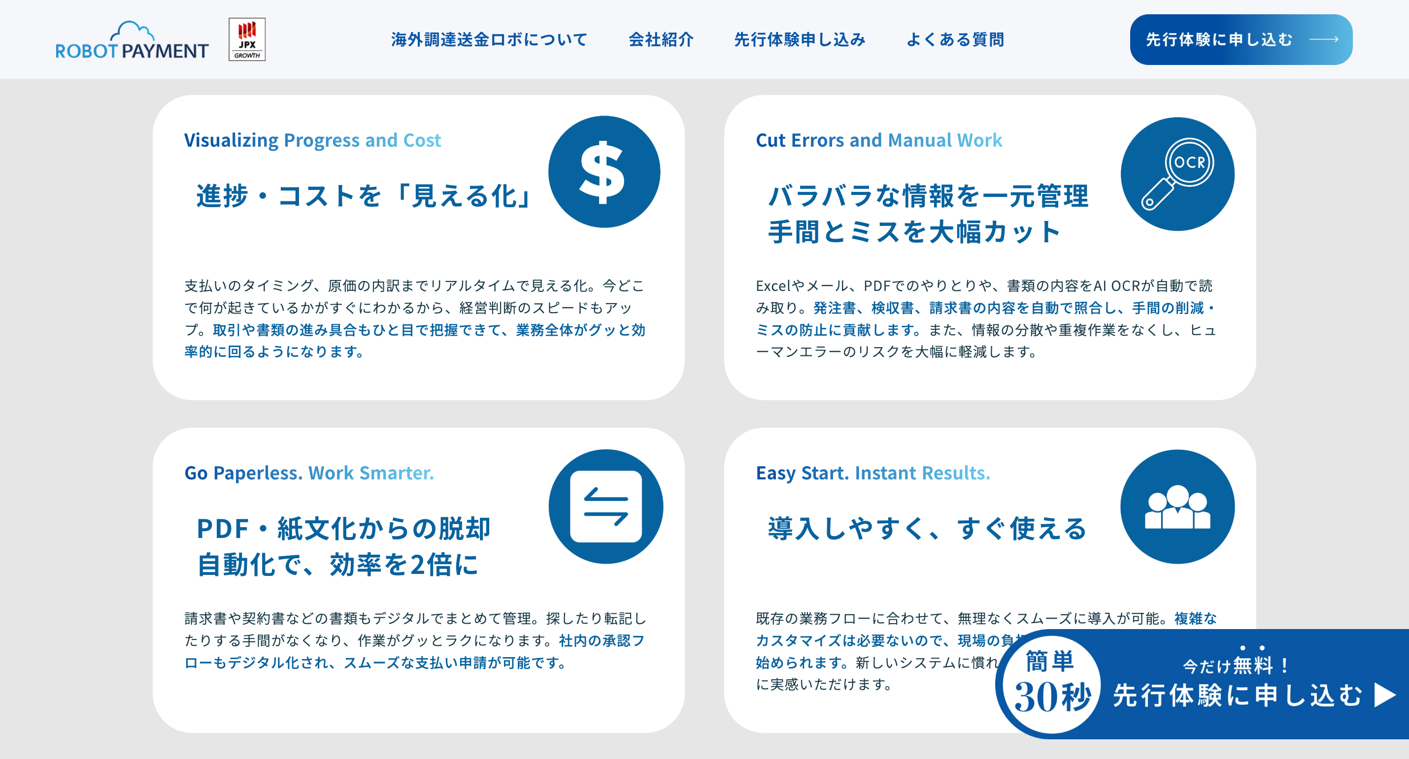
・Clearly explained complex cross-border money flows in simple, confident language ・Converted skeptical visitors into sign-ups within seconds ・Felt more like a friendly global friend than a soulless institution
Delivery section
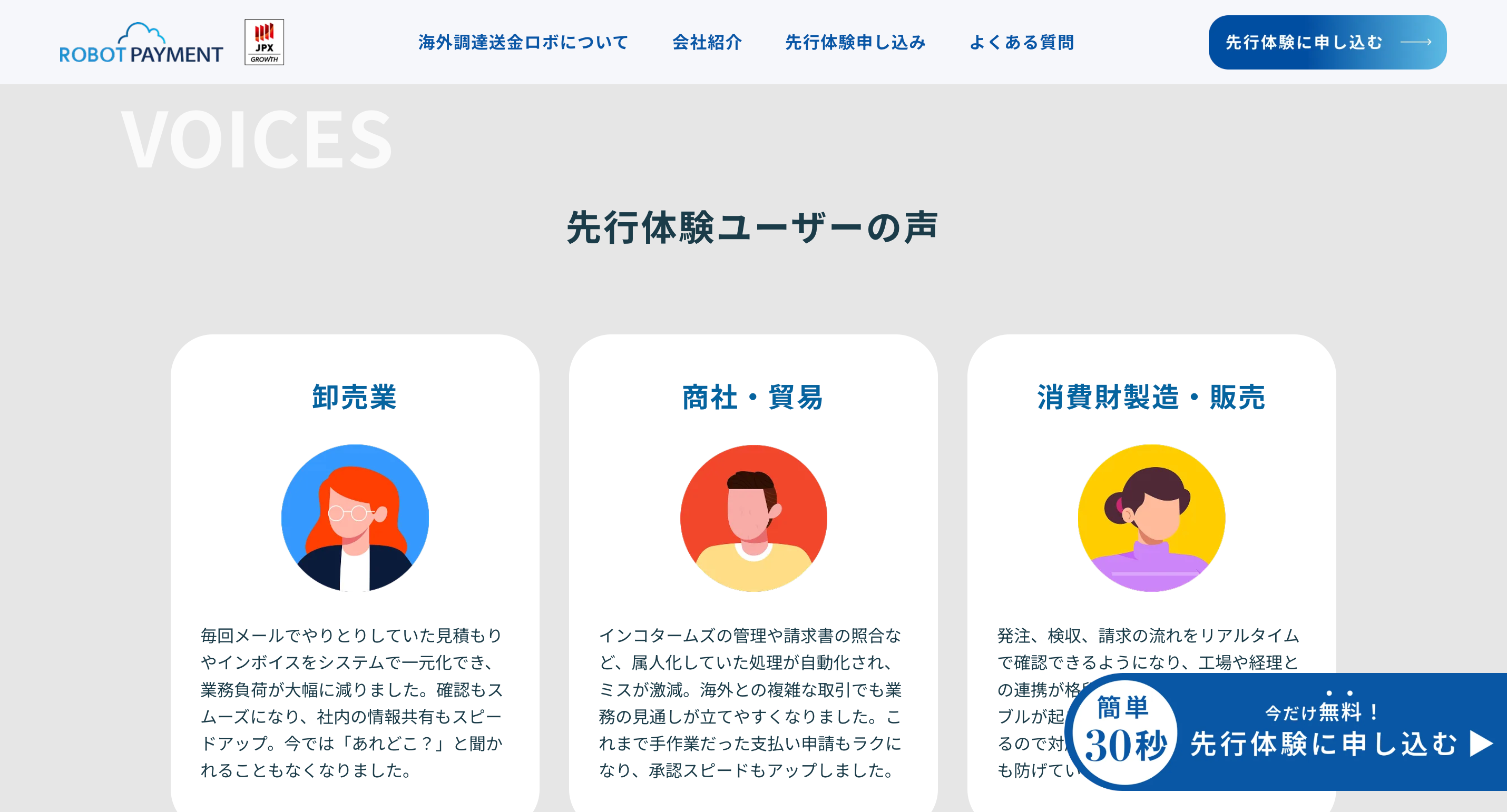
Customer reviews
Investor, Takafumi Horie
What I Delivered (100% from scratch)
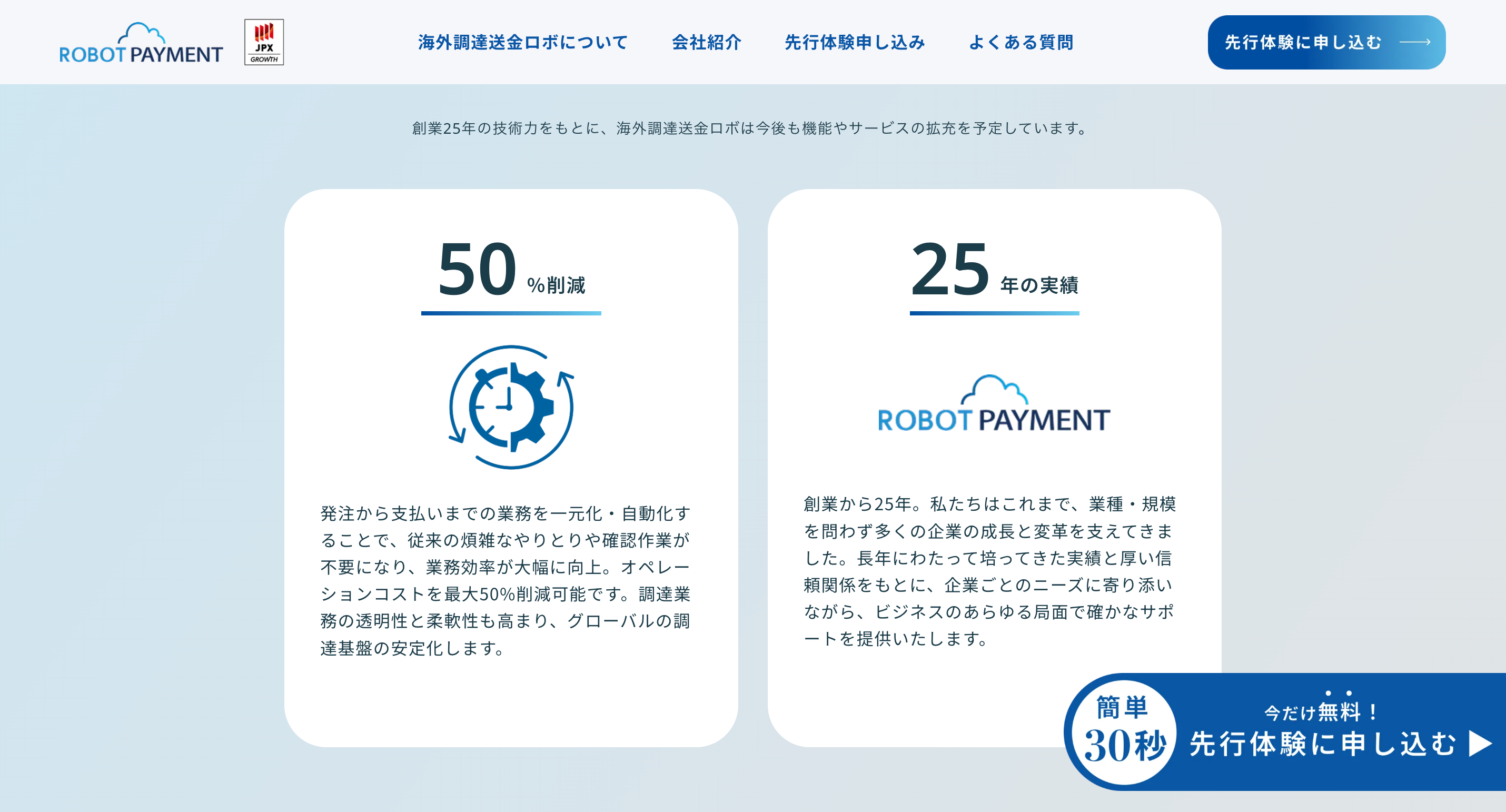
・Full information architecture & user flow design ・Tone-of-voice creation: approachable yet professional, energetic without hype ・Complete copywriting (hero, social proof, comparison tables, FAQ, CTA sections) ・Visual direction & moodboard (bright, modern, passport-stamp inspired aesthetic with real customer photos) ・High-converting layout structure optimized for both desktop and mobile
Investor, Takafumi Horie
Investor, Takafumi Horie
Investor, Takafumi Horie